Self-initiated · iOS · 2025
Velvet: logging a budget entry as fast as tapping a notification
Velvet is a side project I designed and built in SwiftUI. It sits on top of YNAB, the zero-based budgeting tool I use daily, where logging one transaction takes five-plus steps. Velvet gets that down to the speed of tapping a notification.
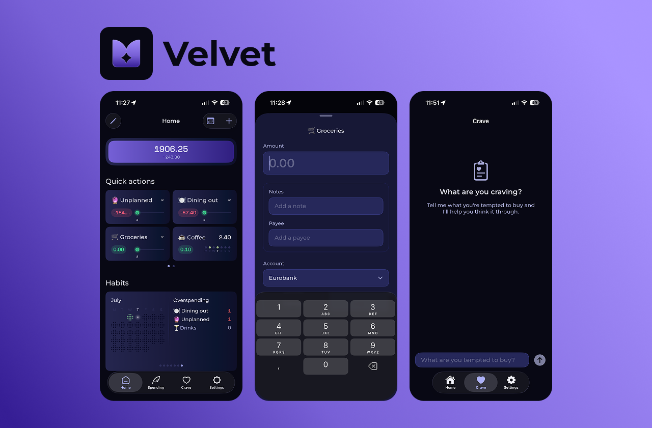
The core loop
Three screens, one idea: remove the steps
Velvet is built for people who already use YNAB: they know their categories and have recurring spending. They don't need to be taught budgeting; they need the logging overhead gone. So the whole app collapses around a single home screen of pre-configured taps, with live budget context and a calm AI for the moments you're tempted to overspend.
Decisions that shaped it
Where the design earned its keep
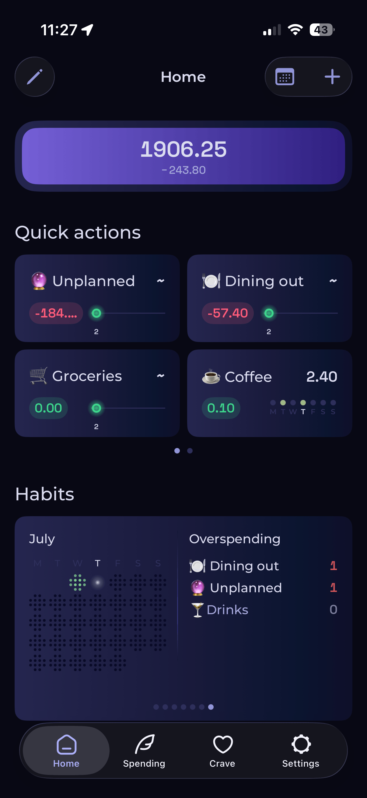
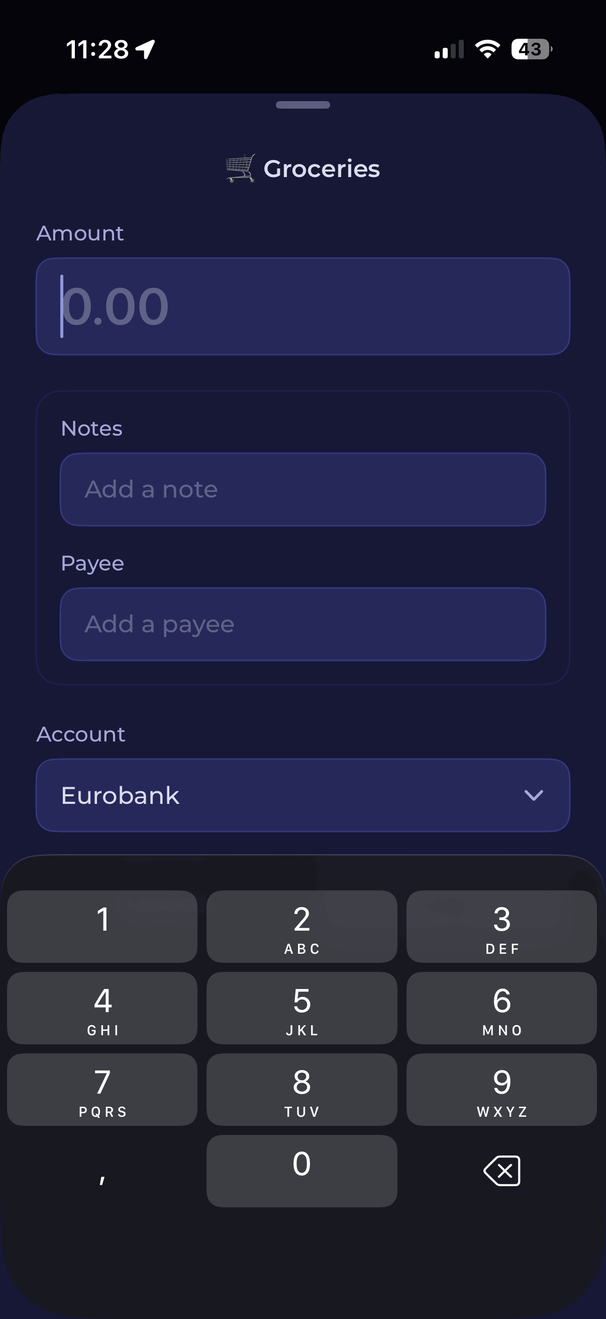
One tap over a five-step flow
Quick Actions collapse the whole logging flow into a single interaction. The trade-off is upfront setup, but committed YNAB users already hold that mental model, so configuring it once is low effort.
Ambient budget context, not buried sub-views
Each card shows live availability pulled from the API and cached for instant display. Pill opacity signals freshness (full opacity is live, reduced is cached), so the data state is honest without a loading screen.
Borrowing iOS conventions instead of teaching new ones
Edit mode uses the wiggle-and-drag pattern people already know from the home screen, with randomised per-card timing so they don't move in sync. No onboarding needed; the gesture is already in muscle memory.
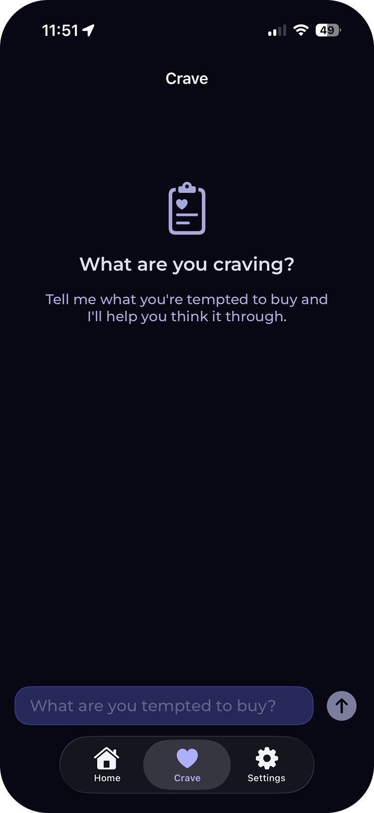
"Crave", not "stop spending"
Framing the AI tab around the craving rather than the prohibition makes it a thinking partner instead of a gatekeeper. The model is tuned to stay conversational: 2–4 sentences, no markdown, never preachy.
Brand
Finding the mark
The logomark is a stylised butterfly, sitting between lightness (financial freedom) and precision (a balanced budget), and doubling as an abstract "V". I explored weight and line quality first, then how the mark held up across icon, badge, and wordmark sizes, before landing on a blue-to-purple gradient icon that reads clearly small and feels rich large.
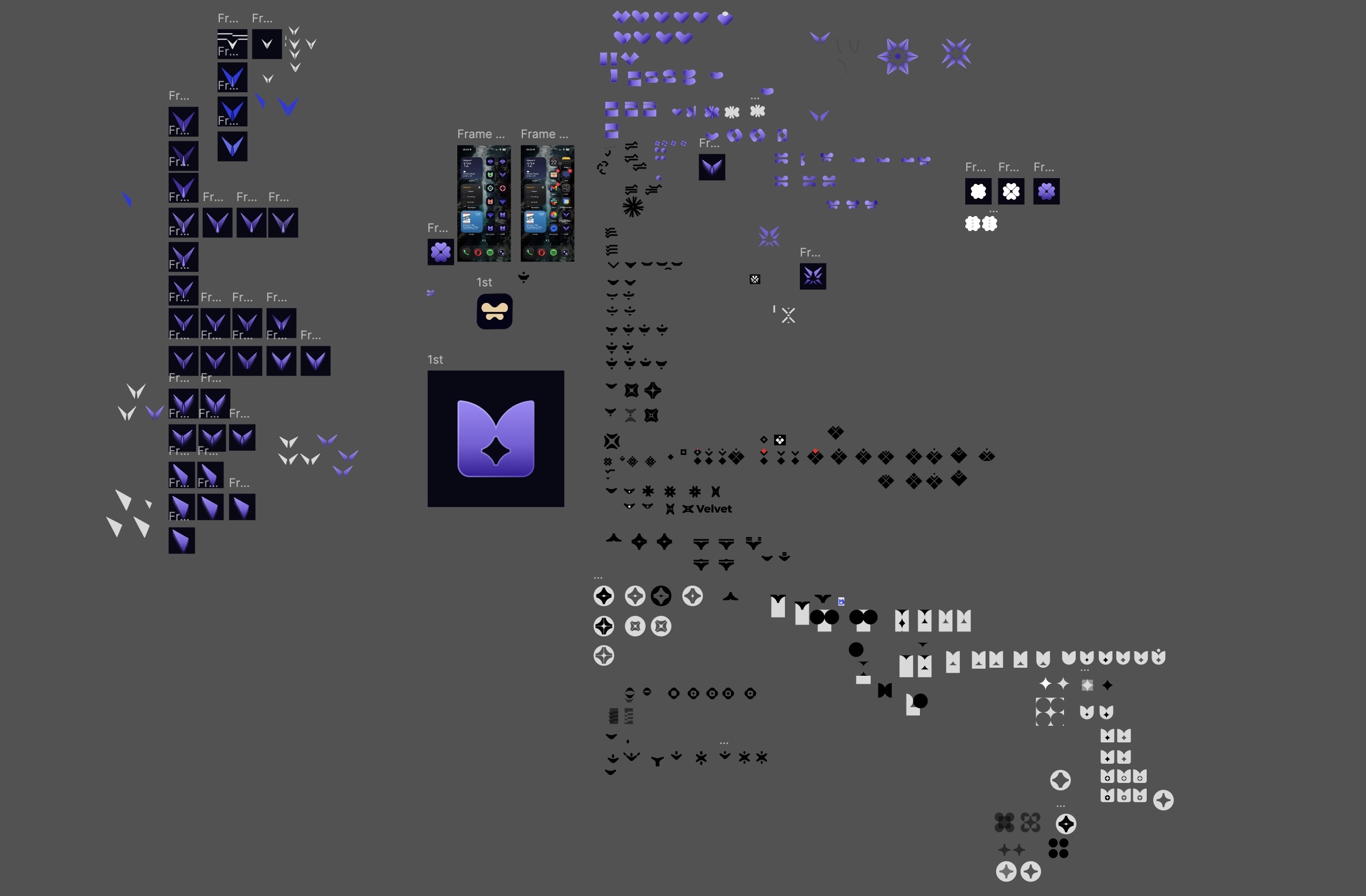
Logomark exploration: weight, line quality, and behaviour across scales
Reflection
What building it (not just drawing it) taught me
Shipping Velvet as a functional prototype rather than static screens forced real decisions about interaction timing, loading states, and error cases that are easy to hand-wave in Figma. Genuine design problems only surfaced once the API latency was real, like how to communicate cached vs. live budget data honestly.
It's still in development, but it reinforced something I keep coming back to: for a tool people use daily, the best UX is usually about ruthlessly removing steps, not adding features. Next I'd want to test the first-run setup with real users and explore a home-screen widget and Siri logging.